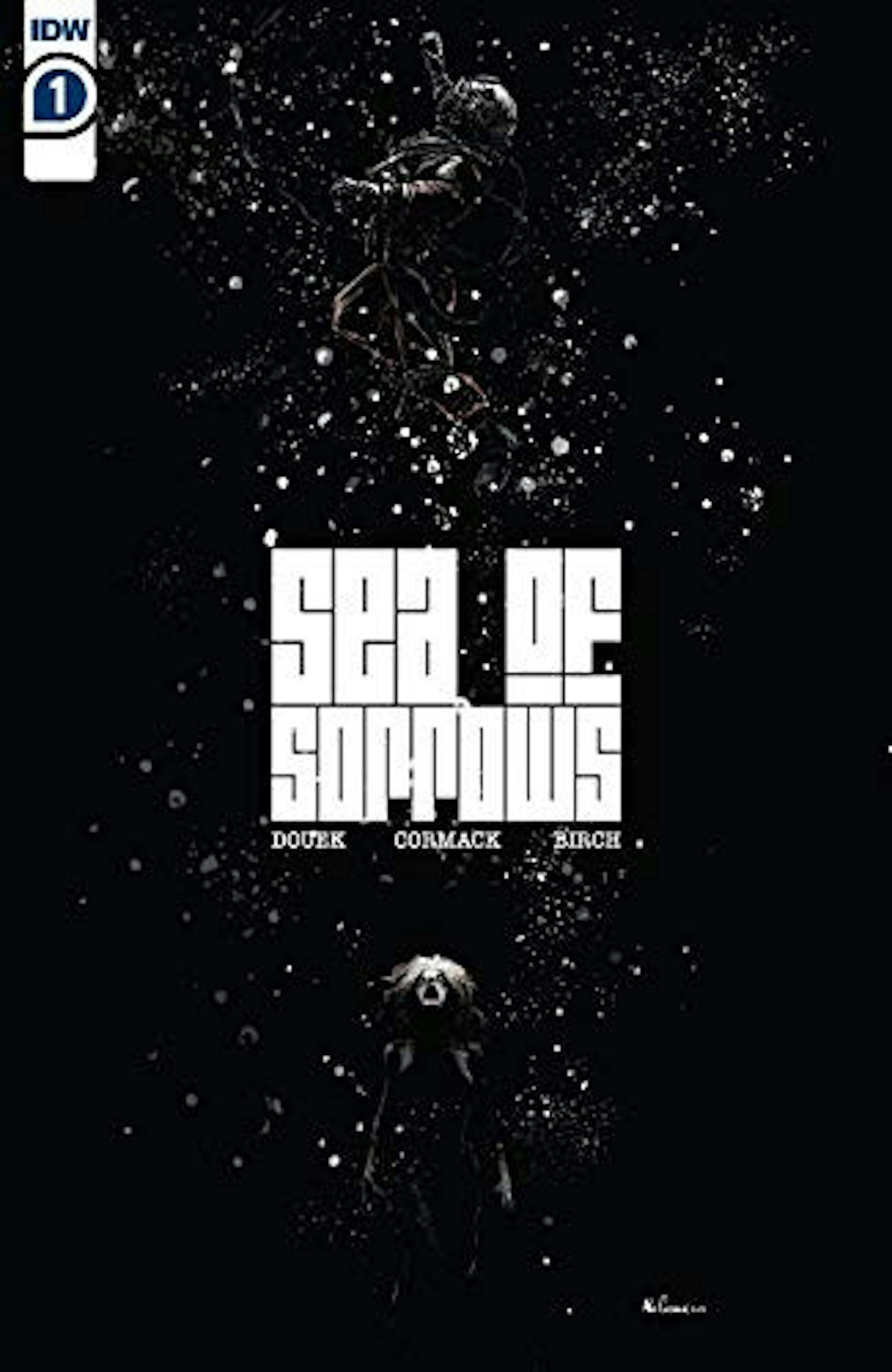
Horror and comics — two media often recognized for their strangeness and willingness to pursue frequently dismissed ideas — should be like peanut butter and jelly. And yet, while there are obvious exceptions like comics "The Walking Dead" (2003–19), "Hellblazer" (1988–2013), (2019–) and "Fatale" (2012–14), the horror genre seems to be the one that often ails a struggling comic. As for “Sea of Sorrows” #1 (2020), horror is on the same level of its story: forgettable and seen before, but possibly on the way to something as great as the art that accompanies it.
Regardless of this issue’s story problems, it is undoubtedly beautiful. Illustrator Alex Cormack does an excellent job at establishing the horror and disgust of the story being told, all while still managing to make the story look amazing, clashing sharp blacks with hued greens and browns. The few locations seen in this issue are draped in a thick, 1920s maritime atmosphere thanks to the excellent color and design work. This is also the only true essence of horror to be found within the issue, as the darkness of the deep ocean is combined with good creature design to give this book some sense of scary surroundings. Unfortunately, this all ends up being for nothing thanks to the issue’s writing and structure.
In the comic world, while writers almost always have an overarching plan for the story they want to tell, they can sometimes fumble in terms of the small-scale elements. Traditional first-act boringness is relegated to the first issue or even dragged over several, and the whole story only works if read like a book or watched like a movie: with the ending set and payoff known. "Sea of Sorrows" #1 falls right into this deadly trap face-first. This entire issue serves as a confusing setup for the rest of the story, and it's one we’ve seen time and time again. Stop me if you’ve heard this one before: A team of sailors, criminals and business men go off to a foreign environment (in this case, the deep Atlantic) in order to find a lost treasure while unaware of the monsters that guard it and the tensions that threaten to tear the crew apart. I know that it's ultimately the details of even a familiar story that make it what it is, but this issue fails in even this regard.
There are no strong characters in this debut. Sure, there are people who say stuff and do things but there is nothing about any of them worth remembering right now. They all sound the same and they all do the same things, with nothing but quickly forgotten names and immediate outward appearance to distinguish them. The actual dialogue suffers as well, with exposition-heavy splurges and little personality to be found in any of it. It's entirely serviceable, but nothing that the reader will remember within a few hours.
Despite all this, “Sea of Sorrows” might still pull through. Even if the structure has been butchered by the monthly release model, author Rich Douek might have a plan for these characters that will allow this story to play out. Douek has proven that he can work well with historical horror in series like "Road of Bones" (2020), and maybe the story will start to pick up in the second issue.
Regardless, this is a weak debut. If even the great artwork cannot make up for the weak storytelling and characters, I’m concerned that the horror to come will end up going down the hatch less like peanut butter and jelly, and more like peanut butter and razor blades. We’ll see in a few months’ time.


