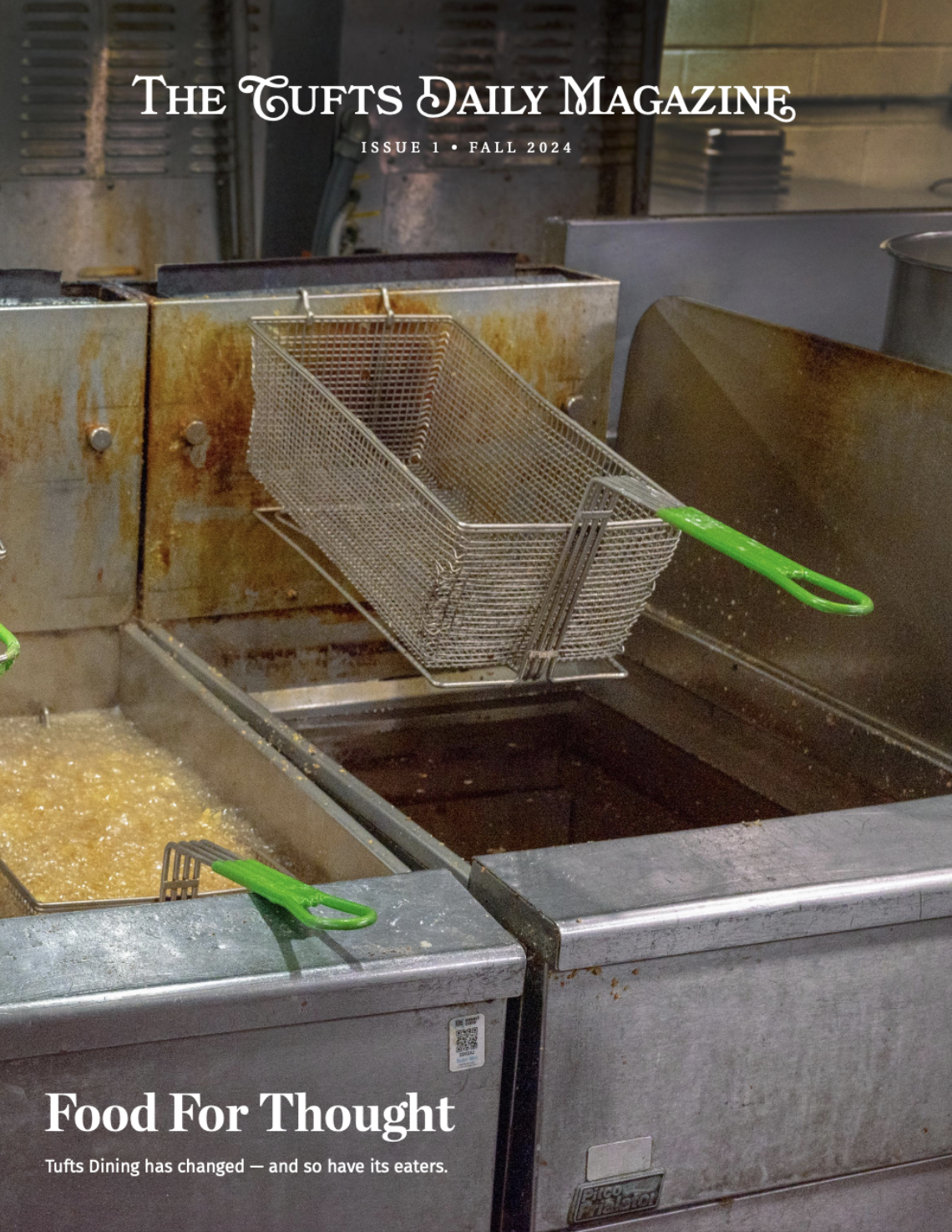
Hello, dear reader! You may have noticed, upon picking up our lovely publication today, that the design looks a bit different than usual. And if you didn't notice, take a closer look; trust me, it is! We've been working on it for about a semester now, seeking inspiration from other newspapers and coming up with new designs of our own. The end result is what you see before you today: new fonts, fresh styles and a more eye-catching front page. (Side note: can you identify the fonts? If so, you'd probably do well on our design team!)
In addition to little things like that, we're also updating the principles behind how we make our layouts. We're placing a heavier focus on having big, bold stories, while at the same time having more smaller, bite-size pieces that you can consume quickly. You'll also see more infographics, illustrations and data visualizations that give you the overview of an article at a glance or that provide insight into some data that wouldn't have fit in the article otherwise. So while you're flipping through to the sudoku to help make that boring lecture class go by faster, take a look at what else we have in here. Or maybe our new designs will catch your eye entirely on their own!
One of our larger goals is to provide a new community for graphic designers on the Tufts campus. We aim to create a space where designers can share their work with other students interested in aesthetic creativity. Both of us had these types of journalism communities before coming to Tufts, and that was where we found the most support with our redesign. Brittany Volk, a previous design editor for the Daily Iowan (DI), helped us create our style guide, and Adam Sullivan, former DI editor-in-chief, provided insight on staff coordination. Additionally, we were inspired by The New York Times, the Hartford Courant and other papers. We consulted with various design bloggers via email as well.
Of course, that's not to say we're only innovating on the print side. We've heard the Internet is apparently kind of a big deal these days, so it's possible you, the reader, might consume more of our articles on a screen than on paper. We're keeping that in mind at the Daily as we transition more and more of our workflow to be web-first, so make sure to check our website for more online exclusives, specially featured articles and perhaps a total facelift as well.
There's a notion in the software industry that you're never really finished with your particular product; you release one version and then continue making improvements. That's why you're probably using Chrome version 44 right now, or why SIS will slowly get more usable over the next 30 years. In a similar vein, the new design you see right now isn't set in stone -- we'll be changing and improving things as the semester goes on. If you want to give us feedback about what you love or hate in the new design, send us an email at daily@tuftsdaily.com. Of course, if you really want to have an influence on the Daily's visual style, you should join our design team.
Sincerely,
Andrew Stephens, Production Director Shirley Wang, Creative Director
More from The Tufts Daily
The problem with presidential debates
By
Monica Reilly
| December 10
From pledges to progress: Why COP can’t be just a photo op
By
Kaashvi Ahuja
| December 10


